Closet Astronomer
Artist, Animator, Videographer, Musician, Astronomer Enthusiast
Thursday, November 28, 2013
Monday, October 7, 2013
I can see my continent from here
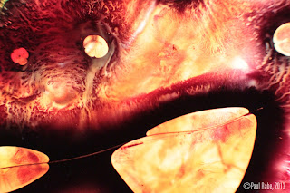
Trying out some new materials under the macro lens. Oil pastel and some different colored plastic giving a more satellite looking down on earth feel.
Tuesday, September 10, 2013
Spontaneous Combustion!
Little characters I made a couple years ago. He might remind you of the minions from Despicable Me which came out shortly after I finished this.( Hollywood is always stealing ideas.) Anyways the little scientist guy is having a little trouble with some spontaneous combustion. Enjoy!
Thursday, September 5, 2013
Heavy Explosives
Here's a little animation I did last year. It was supposed to be just an effect test, but knowing me I took it a little too far. But I had fun and I really like the smoke in this one. Makes me think of old Mike Judge and Bill Plympton. Anyways enjoy the .gif and if you know anyone looking to hire a good effects animator send 'em my way. haha....

Sunday, September 1, 2013
Other blog
Hey Guys,
just made a new tumblr. It's basically the same thing, but on tumblr. Follow me! Tumblr
I think it's about time I share these
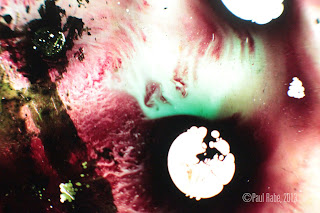
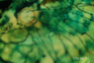
I feel like I haven't made anything in a while so I thought I'd share a couple photos from earlier in the year. These were made with plexi and ink on a light table and photographed with a macro lens. Some of these were photos I used for my postcards during the Senior Exhibition show at MIAD. I'm working on my demo reel so I'll have that done soon hopefully. I'm coloring a lot of old animation frames so it's pretty time consuming, so I'll give you these while you impatiently wait for me to release new content. (yeah right)
Friday, July 19, 2013
Disslide video
Thursday, July 4, 2013
So Far, So Close video
So Far, So Close from Paul Rabe on Vimeo.
So Far, So Close was an attempt to create a visual piece that felt both astronomical and microscopic. I created the imagery using ink and plexiglass layered on top of each other. The depth it created was surprising! Once I was done filming I was going over the footage and found that as beautiful and captivating as these environments were, needed a subject. That's where the animations came into play. The childlike drawings are very humorous against the cosmic backgrounds.I wanted my drawings to interact with the space and give a reason for the movement on screen. I also see them as little characters floating through these spaces. While you are watching, imagine yourself to be an observer, not necessarily looking for a beginning and an end, but simply looking through a telescope (or a microscope!) on a distant world yet to be discovered. Enjoy!
Saatchi Portfolio
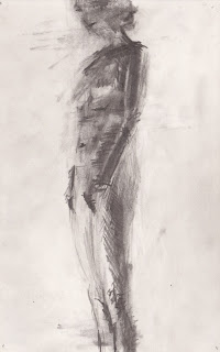
Finished uploading a few of my figure drawings from the past year. If you are interested in purchasing any click here
Enjoy!
Enjoy!
Thursday, June 27, 2013
Okay, so I got a message on my Vimeo from an animation curator for this website called Tallenge telling me to enter into a contest saying I had a really good chance to win(probably what they say to everyone to get them to participate). It's suppose to be a talent platform where you submit your work and people vote on it and you win money. Could be a scam/not really that great/stupid website, but I thought I'd give it a try. So if you have the time watch my vid and go and vote for me, I'd really appreciate it. Thanks!
Vote here!
Vote here!
Monday, May 20, 2013
Senior Exhibition Space
Here's a few pictures from my Senior Exhibition space at Milwaukee Institute of Art & Design in May of 2013. Included are drawings, figure drawings, interactive pieces, and video.
Overtake
Ink, gesso on paper
Here's a link to the animation
Arrival
ink, gesso on paper
ink, gesso on paper
Embrace
graphite on paper
graphite on paper
This an interactive podium with a live feed screen connected to a camera inside the podium. The orange triangle contains ink under a layer of thin plastic creating an interactive surface the viewer could place there finger upon and move the ink inside. In the next image you will see what it looks like as it is fed to the screen.
The camera was so close behind the orange triangle that when you touched it you could see your finger print on the screen through the inky texture. I wanted to offer that macro look that is so prevalent in my videos, but I also wanted to make it interactive. I wanted to bring viewers into the creation of my work. It was sort of an attempt at a behind the scenes or making of for my videos. It was a way for me to show how my videos are made instead of just telling how they were made.
Here are all of my figure drawings I chose to show.
And below that is another interactive piece. A shelf made of two pieces of thin plexi-glass with ink in between them. Sort of like a giant slide you would observe under a microscope. Lights underneath the shelf illuminated the surface and created a cosmic aesthetic relative to the night sky. One could walk up to the shelf and press their finger into the surface causing the ink inside to explode into life and create all sorts of interesting shapes and textures. I could see this being installed in a place like a bar or lounge where people wouldn't realize it is interactive until pressure is applied by an object or resting an elbow on the surface.
Subscribe to:
Posts (Atom)


